HomeDunhill Cigarettes


-
Cigarette company's shares are growing despite the anti-smoking law.
Analysts, however, believe that investors will be indifferent to the new anti-smoking laws as long as the price of tobacco products is steadily increasing.
-
Women don't want to quit smoking because of the weight gain myth.
Smoking can lead to complete indifference to food because the nicotine muffles taste buds.
-
Cigarettes made in America were recognized the most harmful to health.
According to studies, the content of nitrosamines (one of the strongest carcinogens) in foreign cigarettes are significantly lower than in American Marlboro, in some cases is lower more than 50%.
Dunhill - The Fine Cut of Elegance
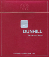
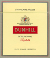
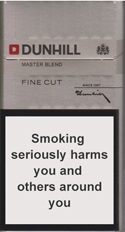
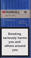
When discussing the history of design in the tobacco industry, one must remark the special place of Dunhill. Ever since the beginning of this brand, Dunhill was different. In fact, most of the design solutions they advertised were not only using a completely different pack, but they were at the same time innovative and ground-breaking. When most of the cigarettes in fashion came in luxurious, baroque packs, Dunhill cigarettes were advertised in minimalistic packs, and vice versa.
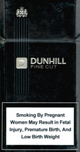
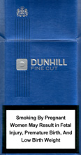
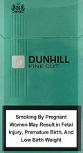
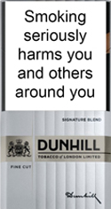
From the Far-Eastern Dunhill Nanocut to the white version of Dunhill Lights, to the English classic Dunhill De Luxe, variations have never been more intuitive. Even so, one can determine a list with the visual constants used to remind you that you're dealing with a pack of Dunhill Cigarettes:
- They use the same font for the name. There are few exceptions to this rule.
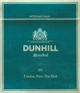
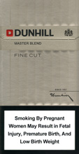
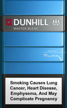
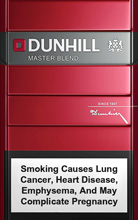
- The color palette or color scheme is quite stable: crimson red, dark black, pearl white and light blue. The only type of Dunhill cigarette that doesn't fit in this strategy is Menthol, which must be green, to follow the general pattern. But even here the other constants apply.
- Dunhill advertises squared-shaped packs as a distinct sign of their identity. These packs are almost identical in terms of secondary design with the others.
- Either the Dunhill emblem or the Dunhill logo precedes the name.
- There's no general tagline associated to Dunhill cigarettes (even if there are cases and local varieties which may display a tagline). This suggests that the identity of this brand is in design, not in a specific message.
- Wherever you buy Dunhill, the cigarettes look exactly the same. This global consistency ensures the stability of the brand all across the world.
The more we try to determine the exact factors that make Dunhill packs look so good, the more it escapes us, and this is precisely what makes the concept brilliant.


.jpg)
